User interface is the front-end application view to which user interacts in order to use the software. User can manipulate and control the software as well as hardware by means of user interface. Today, user interface is found at almost every place where digital technology exists, right from computers, mobile phones, cars, music players, airplanes, ships etc.
User interface is part of software and is designed such a way that it is expected to provide the user insight of the software. UI provides fundamental platform for human-computer interaction.
UI can be graphical, text-based, audio-video based, depending upon the underlying hardware and software combination. UI can be hardware or software or a combination of both.
The software becomes more popular if its user interface is:
- Attractive
- Simple to use
- Responsive in short time
- Clear to understand
- Consistent on all interfacing screens
UI is broadly divided into two categories:
- Command Line Interface
- Graphical User Interface
Command Line Interface (CLI)
CLI has been a great tool of interaction with computers until the video display monitors came into existence. CLI is first choice of many technical users and programmers. CLI is minimum interface a software can provide to its users.
CLI provides a command prompt, the place where the user types the command and feeds to the system. The user needs to remember the syntax of command and its use. Earlier CLI were not programmed to handle the user errors effectively.
A command is a text-based reference to set of instructions, which are expected to be executed by the system. There are methods like macros, scripts that make it easy for the user to operate.
CLI uses less amount of computer resource as compared to GUI.
CLI Elements
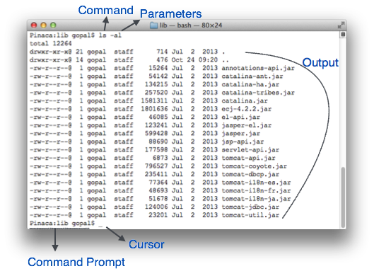
A text-based command line interface can have the following elements:
- Command Prompt – It is text-based notifier that is mostly shows the context in which the user is working. It is generated by the software system.
- Cursor – It is a small horizontal line or a vertical bar of the height of line, to represent position of character while typing. Cursor is mostly found in blinking state. It moves as the user writes or deletes something.
- Command – A command is an executable instruction. It may have one or more parameters. Output on command execution is shown inline on the screen. When output is produced, command prompt is displayed on the next line.
Graphical User Interface
Graphical User Interface provides the user graphical means to interact with the system. GUI can be combination of both hardware and software. Using GUI, user interprets the software.
Typically, GUI is more resource consuming than that of CLI. With advancing technology, the programmers and designers create complex GUI designs that work with more efficiency, accuracy and speed.
GUI Elements
GUI provides a set of components to interact with software or hardware.
Every graphical component provides a way to work with the system. A GUI system has following elements such as:
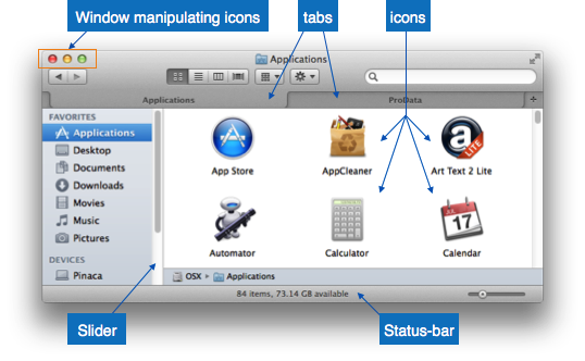
- Window – An area where contents of application are displayed. Contents in a window can be displayed in the form of icons or lists, if the window represents file structure. It is easier for a user to navigate in the file system in an exploring window. Windows can be minimized, resized or maximized to the size of screen. They can be moved anywhere on the screen. A window may contain another window of the same application, called child window.
- Tabs – If an application allows executing multiple instances of itself, they appear on the screen as separate windows. Tabbed Document Interface has come up to open multiple documents in the same window. This interface also helps in viewing preference panel in application. All modern web-browsers use this feature.
- Menu – Menu is an array of standard commands, grouped together and placed at a visible place (usually top) inside the application window. The menu can be programmed to appear or hide on mouse clicks.
- Icon – An icon is small picture representing an associated application. When these icons are clicked or double clicked, the application window is opened. Icon displays application and programs installed on a system in the form of small pictures.
- Cursor – Interacting devices such as mouse, touch pad, digital pen are represented in GUI as cursors. On screen cursor follows the instructions from hardware in almost real-time. Cursors are also named pointers in GUI systems. They are used to select menus, windows and other application features.
Application specific GUI components
A GUI of an application contains one or more of the listed GUI elements:
- Application Window – Most application windows uses the constructs supplied by operating systems but many use their own customer created windows to contain the contents of application.
- Dialogue Box – It is a child window that contains message for the user and request for some action to be taken. For Example: Application generate a dialogue to get confirmation from user to delete a file.
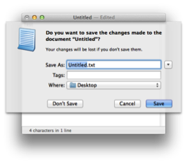
- Text-Box – Provides an area for user to type and enter text-based data.
- Buttons – They imitate real life buttons and are used to submit inputs to the software.
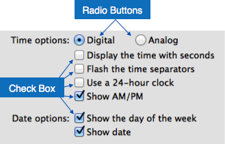
- Radio-button – Displays available options for selection. Only one can be selected among all offered.
- Check-box – Functions similar to list-box. When an option is selected, the box is marked as checked. Multiple options represented by check boxes can be selected.
- List-box – Provides list of available items for selection. More than one item can be selected.
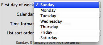
Other impressive GUI components are:
- Sliders
- Combo-box
- Data-grid
- Drop-down list
Explore our latest online courses and learn new skills at your own pace. Enroll and become a certified expert to boost your career.
User Interface Design Activities
There are a number of activities performed for designing user interface. The process of GUI design and implementation is alike SDLC. Any model can be used for GUI implementation among Waterfall, Iterative or Spiral Model.
A model used for GUI design and development should fulfill these GUI specific steps.
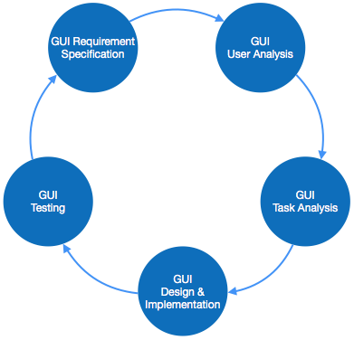
- GUI Requirement Gathering – The designers may like to have list of all functional and non-functional requirements of GUI. This can be taken from user and their existing software solution.
- User Analysis – The designer studies who is going to use the software GUI. The target audience matters as the design details change according to the knowledge and competency level of the user. If user is technical savvy, advanced and complex GUI can be incorporated. For a novice user, more information is included on how-to of software.
- Task Analysis – Designers have to analyze what task is to be done by the software solution. Here in GUI, it does not matter how it will be done. Tasks can be represented in hierarchical manner taking one major task and dividing it further into smaller sub-tasks. Tasks provide goals for GUI presentation. Flow of information among sub-tasks determines the flow of GUI contents in the software.
- GUI Design & implementation – Designers after having information about requirements, tasks and user environment, design the GUI and implements into code and embed the GUI with working or dummy software in the background. It is then self-tested by the developers.
- Testing – GUI testing can be done in various ways. Organization can have in-house inspection, direct involvement of users and release of beta version are few of them. Testing may include usability, compatibility, user acceptance etc.
GUI Implementation Tools
There are several tools available using which the designers can create entire GUI on a mouse click. Some tools can be embedded into the software environment (IDE).
GUI implementation tools provide powerful array of GUI controls. For software customization, designers can change the code accordingly.
There are different segments of GUI tools according to their different use and platform.
Example
Mobile GUI, Computer GUI, Touch-Screen GUI etc. Here is a list of few tools which come handy to build GUI:
- FLUID
- AppInventor (Android)
- LucidChart
- Wavemaker
- Visual Studio
User Interface Golden rules
The following rules are mentioned to be the golden rules for GUI design, described by Shneiderman and Plaisant in their book (Designing the User Interface).
- Strive for consistency – Consistent sequences of actions should be required in similar situations. Identical terminology should be used in prompts, menus, and help screens. Consistent commands should be employed throughout.
- Enable frequent users to use short-cuts – The user’s desire to reduce the number of interactions increases with the frequency of use. Abbreviations, function keys, hidden commands, and macro facilities are very helpful to an expert user.
- Offer informative feedback – For every operator action, there should be some system feedback. For frequent and minor actions, the response must be modest, while for infrequent and major actions, the response must be more substantial.
- Design dialog to yield closure – Sequences of actions should be organized into groups with a beginning, middle, and end. The informative feedback at the completion of a group of actions gives the operators the satisfaction of accomplishment, a sense of relief, the signal to drop contingency plans and options from their minds, and this indicates that the way ahead is clear to prepare for the next group of actions.
- Offer simple error handling – As much as possible, design the system so the user will not make a serious error. If an error is made, the system should be able to detect it and offer simple, comprehensible mechanisms for handling the error.
- Permit easy reversal of actions – This feature relieves anxiety, since the user knows that errors can be undone. Easy reversal of actions encourages exploration of unfamiliar options. The units of reversibility may be a single action, a data entry, or a complete group of actions.
- Support internal locus of control – Experienced operators strongly desire the sense that they are in charge of the system and that the system responds to their actions. Design the system to make users the initiators of actions rather than the responders.
- Reduce short-term memory load – The limitation of human information processing in short-term memory requires the displays to be kept simple, multiple page displays be consolidated, window-motion frequency be reduced, and sufficient training time be allotted for codes, mnemonics, and sequences of actions.
Leave a Reply